Visuelle Kommunikation
Master
Rahel Hediger
To See and Be Seen
Perceiving Space on a Two-Dimensional Surface in Poster Design


Posters hang in public spaces, are printed on thin paper and pasted against flat walls.
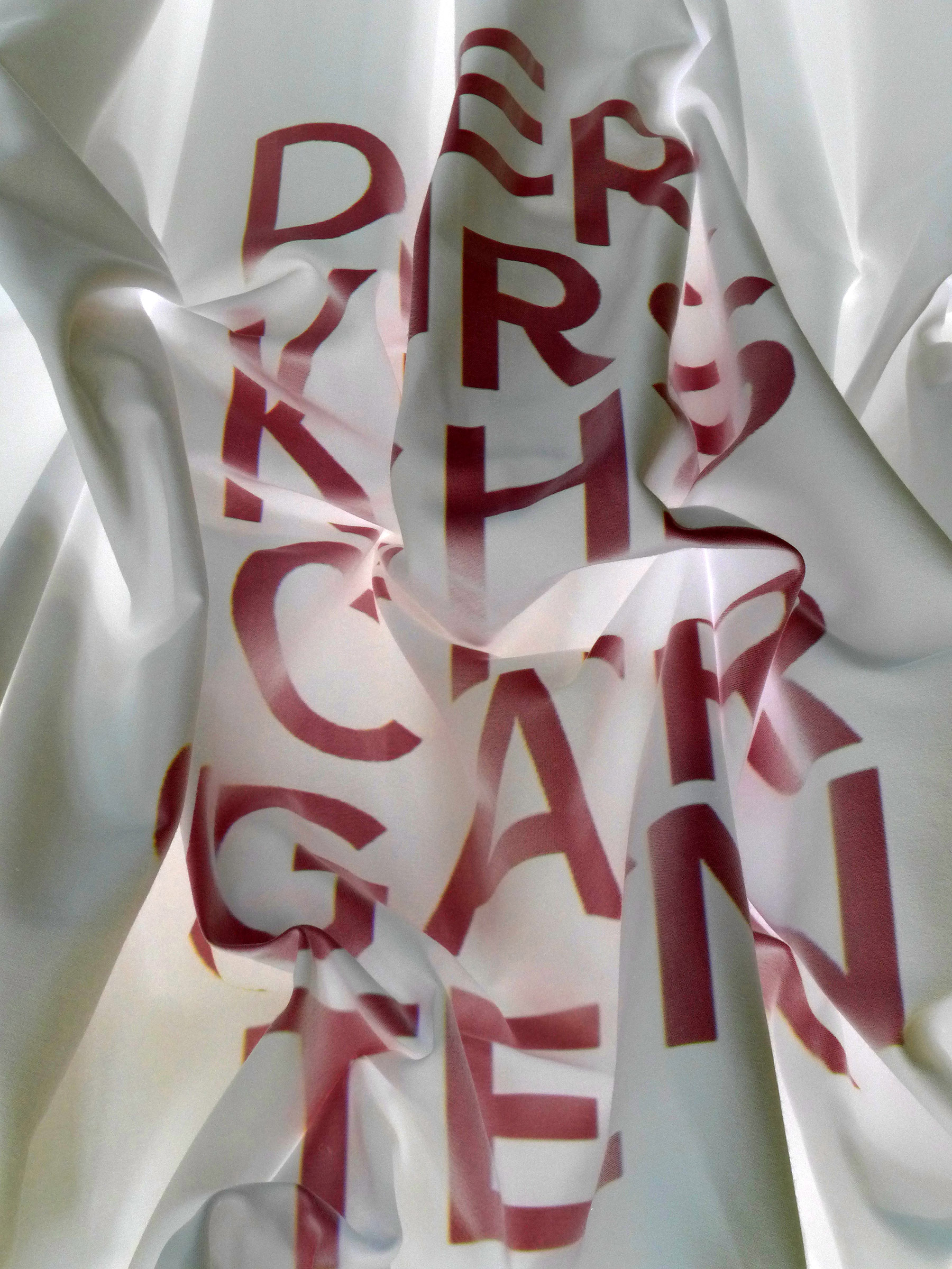
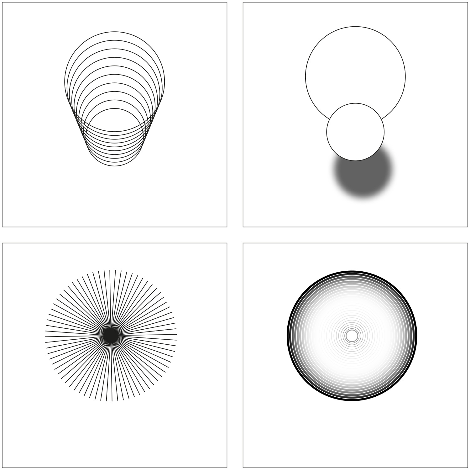
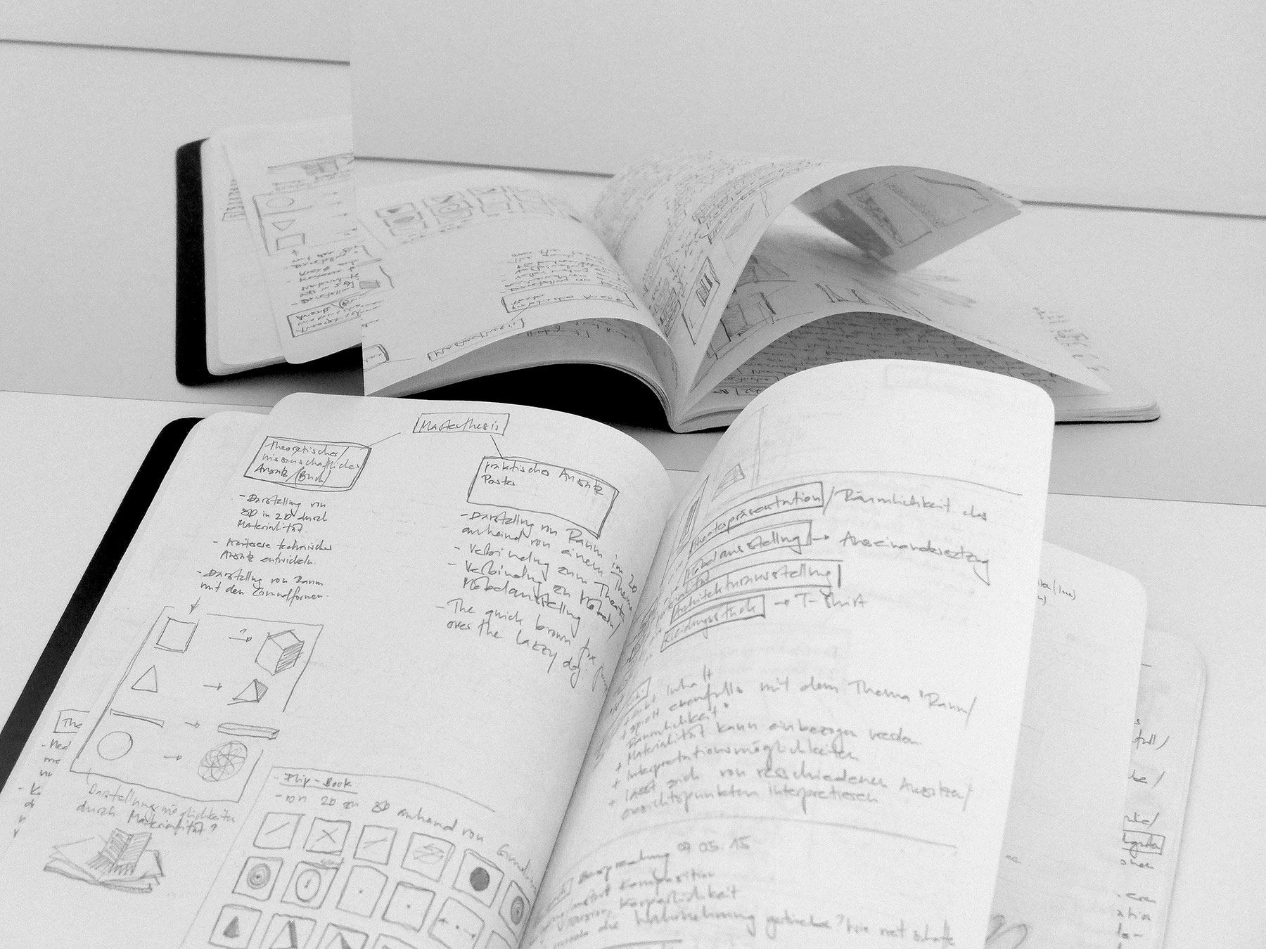
Their goal is to convey information to hurrying passers-by, to show things and evoke wishes no one had desired until then. For this purpose, a poster has only a short moment at disposal. And in this short moment, a poster should be able to catch the attention of passers-by, to draw viewers into its world and space: on a surface, which is to stir curiosity and interest, so that passers-by feel an urge to immediately buy or visit the product thus advertised. The goal is to integrate viewers into the presentation by arousing a positive association or embedding a means to control viewers’ perception. That’s why perspective views are one of the most important design resources. However, a poster has much more possibilities to represent three-dimensionality than this was understood by classical art. In traditional art, to directly address and communicate with viewers was frowned upon for a very long time. But contrary to art, a poster does not have to be a nice or beautiful object, so the integration of the beholder into the image is the main goal of a poster. Thanks to perspective, viewers can be guided and seduced and the perspective supports the statement of the poster. In a poster, this effect is based on a complex interaction between images, typefaces, and colours. On the one hand, those three levels of information enhance the message of a poster; on the other one, these different elements can be individually interpreted by various technical design options. It depends on the interpretation and realization of the design, how strong the appearance and the effect of depth will be. But even if, today, there are more possibilities to show three-dimensionality, there is nevertheless a contradiction – for how is it possible to represent a spatial, that is, three-dimensional illusion on a two-dimensional surface? Thus, this question still arises in today’s poster design. And this is exactly where my Master’s thesis sets in, based on the question: “How is it possible to represent three-dimensionality on a two-dimensional surface?” Or rather: “Which design elements are necessary to represent space in a poster?” I intend to explore three-dimensional aspects and try and show different visual possibilities based on various techniques and design strategies. I also intend to play with illusionistic and visual design options, to exhaust them as much as possible and define their limits. I would like to find out which possibilities I have as a designer to generate space on a flat surface and how I can stop passers-by. How can a poster be fascinating or even irritating enough to attract the attention of a beholder, and how can I ensure the message is going to be remembered. A poster strives to provide a new dimension. And this dimension can be generated by the illusionistic effect of a three-dimensional approach, even when printed on a thin and flat paper.
Rahel Hediger
rahel.hediger@gmail.com
Institut Visuelle Kommunikation, FHNW HGK, Freilager-Platz 1, CH-4023 Basel
+41 61 228 41 11, info.vis_com.hgk@fhnw.ch, www.fhnw.ch/hgk/ivk


