Institut Kunst
Master
Almira Medaric
Essence Book
2015
Paragraphs on the Essence Book
It has been years since I started collecting images for my own inspiration, from magazines and books, but mostly digitally. I had the habit of collecting images as research for the objects I make. Coming from different domains, as well as from architecture, fashion, design or even graphic design, these images are at the basis of my work. Because of these interests the body becomes part of the development. The scale, the lines and as well the final object are made from and for the human body.
The project related to the Essence Book first started with a storyboard, in which I pasted printed pictures and texts that inspired me and sketches I made. At the time, it was more a tool for myself, a tool for stimulus and organizing my mind.
The digital play is in this sense an essential role in my work. I use images from the internet in my research and computer programs to create my patterns. Theses are the reasons this collection could actually be a good way to understand my practice.
In this book, we can now find my whole collection of images, which after printing gained even more importance.
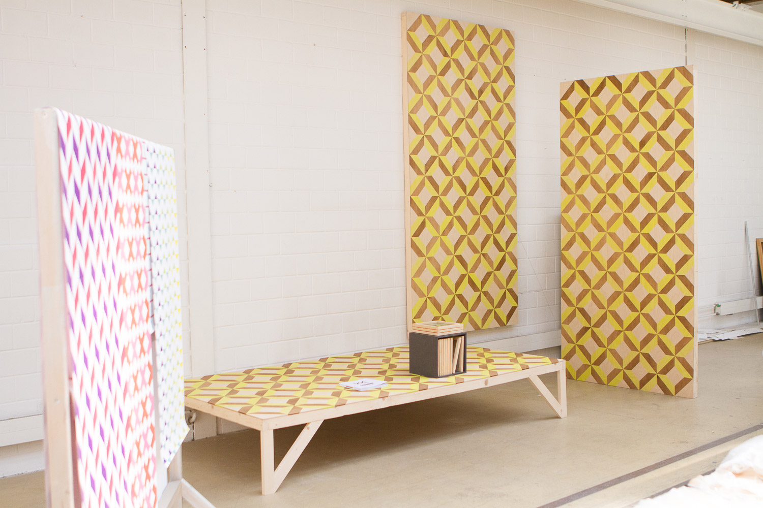
The idea behind the Essence Book, as I call it, is to create a tool with which to see my objects and their purpose. It is a tool for the visitor, so he could make links between the book and the objects.
Alone, the book is also a work showing a box containing my thinking and my inspiration in my own visual language.
The book shows the objects surrounding me.
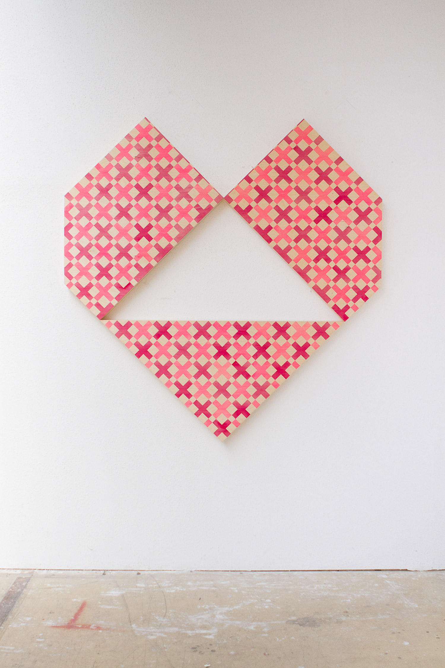
I always represented myself the world made out of geometric forms. When I took a deeper look at the world, I saw geometry everywhere – the human body, the plants, the streets, and all the traffic signs are built with geometry. Inspired by this idea, I use it as a medium in this book and in my objects.
The geometry does not show itself only in images, but also in the «text». We are not actually able to see it as it has been transformed in colorful blocks. The main goal was to have geometry everywhere; in the images, but also within my own forms meaning the text lines.
The book tells a geometric story.
Like in my whole practice, geometry is, in fact, a medium in order to create; that way, it is always present and the basis of all my work. In writing, geometric patterns could be my words. So instead of using a text, I use colorful rectangles creating a link between the pictures. The link is visual, through the form but also through the color. On each page, the colors of the blocks are taken from pictures and play with and link architecture, graphic design, and fashion.

The blocks are telling the story of my work in this sense. From the links made between the images, the reader could create stories himself and fill the colorful blocks out. There is indeed no act for censorship done, as the narrative stays a very important part of this project.
Rules of the game
The book shows my way of working, with the need for order. My mind is actually geometrically built, filing each idea in its folder to function; like a computer. For this reason I created a system of rules for my practice by using geometry in vertical, horizontal and diagonal (45°) lines. After defining the form, the scale of a work is decided relating to the human body. Those rules apply to all of my objects and my patterns.
The system in the book is the same one I use in my practice and keeping the playfulness in its center.
The object itself
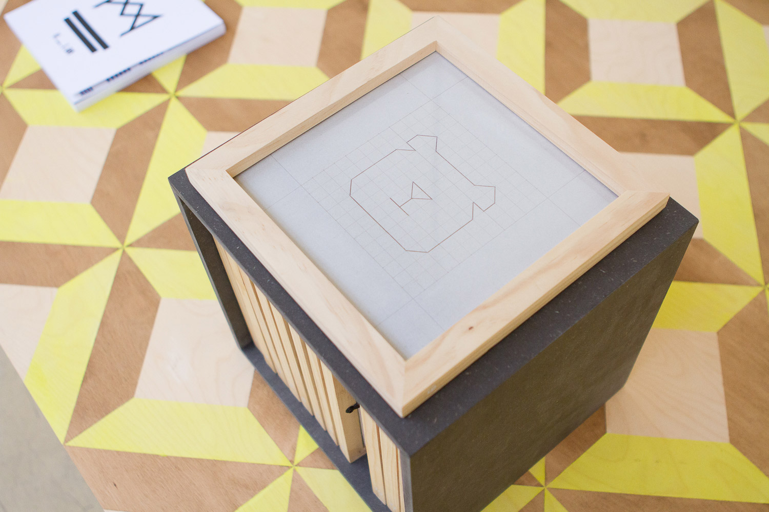
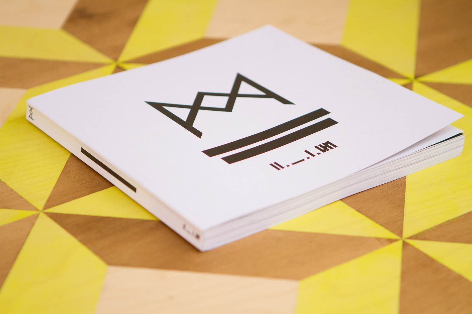
The Essence book is in itself a block with its bold and geometric form containing the essence of my thoughts. A box filled with my research. The form I chose for it is in that way not insignificant.
First of all, the square is a primary form in geometry, the alchemical symbol of earth and the primary form of my favorite artist; Sol LeWitt. His work has always been inspiring to me, mostly because the set of rules he uses involving geometric forms and his use of arithmetic formulas to mark a beginning and an end to a work.
In a few of his series, he also created books which are a representation of his work method. The Essence Book is also such a representation for me, as well as a work in its own. Contemplating the size of my own book I felt inspired by him and decided to use the same format he did for his publications.
The square is also the duplication of two triangles which is my favorite form. The triangle appears in the chapter openers dividing a black square and the pieces to be seen as a tangram which is a Chinese game using also geometry as a medium to play. The tangram is a gaming which is made of seven geometric shapes. From those forms put into place a large number of images appear – animals, persons, landscapes, etc. . In the legend, a sage explain that from few shapes he had the whole world in from of him.
This then shows a new game at the beginning of each chapter.
I divided the images of each chapter into themes which are included in my practice. In them, the geometry plays a different role. First comes the form, basis of my concepts, then the played one, later the colors in the form, and at the end the game.
The outcome
The game made the most sense to me with this work, as it is showing every one of the domains inspiring me without any filter. Playing between my rules and those of graphic design, I created my book digitally with digital images. Even if the importance of the digital work is not deniable I decided to print it and make it into a tangible object. The Essence book is to be touched and be seen at the same time.
Every time I create a work I choose its proportions and size relating to the human body. Even when knowing the importance of anatomy in my work, it became clearer when looking at the images put together in the book.
I also discovered, going through the pages that the female body shows to be the red thread binding it all together. From the beginning to the end of the book pictures of women keep appearing. I never really noticed it before, but it suddenly became very evident.
In the same way, few other themes gained even more importance while looking at the book.
For example, we can see how much the contrast of colors is important. This became clear when I put it all together. Working on the color blocks I started to pay attention so that a color was only used once, creating a large palette in the book; from a deep black, to an almost white, through very saturated colors. This way each page or pair of pages became unique through the used color material.
In conclusion, the female body, color use and geometry are the most vital elements in my work.
Almira Medaric
www.almiramedaric.com
Institut Kunst, HGK FHNW, Freilager-Platz 1, CH-4023 Basel
+41 61 228 40 77, info.kunst.hgk@fhnw.ch, www.fhnw.ch/hgk/iku, www.institut-kunst.ch

